

Active Users Grow to 18%
How I broke silos and owned the design and delivery of a monumental, integrations dashboard
ROLE
UX Designer
DURATION
September 2022 - May 2023
BUSINESS
COLLABORATORS
Jr. UX Designer,
Sr. UX Researcher,
Head of Design,
User Assistance Writer,
2 Directors of Product Development,
Development team,
SVP of Technology,
Product Manager,
Data Analyst,
Support team,
Sales team, and
QA team
the business and its users

FIELDGLASS
- a web app for hiring, managing, and paying contractors, temporary workers, and service providers
- offers a Self-Service Dashboard where users can set up and monitor integrations
Business Goal: The entire organization of SAP was on a 5-year plan to enable customers' independence through tools such as the Self-Service Dashboard.

CONFIGURATION MANAGER USERS
- an IT specialist supporting a procurement and/or workforce program management office
- responsible for setting up and monitoring integrations in Fieldglass's Self-Service Dashboard
User Goal: Ensure the continuous movement of data between Fieldglass and other products so that workforce management operations run without interruption.
dashboard dilemma
Fieldglass' Sales team: "Self-Service Dashboard gives you independence!"

Customers:

PROBLEM STATEMENT
While customers desired the independence, many customers rejected the Self-Service Dashboard because it looked difficult in sales demos, leading to an overburdened Fieldglass Support team left to manage integrations on customers' behalf.
initial resesarch
problem discovery
Sales team members came to me and reported that clients immediately rejected the Self-Service Dashboard simply by its appearance.
"It does not look easy to use."

functionality
I studied product documentation to understand what I would be working with, using sticky notes to remind me.

usage data
I pulled data and learned Configuration Managers heavily utilized the integration setup tool.

best practices
The Nielsen Norman Group wrote that effective dashboards deliver data visualization and actionable information.

product consistency
Exploring other dashboard's in SAP suite to support another business goal of UI standardization

heuristic analysis

room for improvement
Researching the functionality, usage, best practices, and product landscape, I identified shortcomings and opportunities:
- Unclear order of operation
- Missed opportunity to surface actionable information
- Lack of personalization
- Redundant tiles
- Counterintuitive visual hierarchy
- Mismatched pairs of icons and headings
- Ineffective microcopy
- Inefficient use of space
goals
benefit users
actionable
Visualize data so that Configuration Managers can take quick actions.
tailored
Support the Configuration Manager's most frequent or recent actions.
informative
Guide Configuration Managers so that they can explore and learn about the dashboard.
benefit the business
empower the sales team
Sales teams will see positive reception when showcasing the Self-Service Dashboard.
relieve the support team
Support teams will be available for more important tasks.
increase usage
SAP will equip more customers with comfort and actionability when navigating through the tool.
defining the solution
I collaborated with engineering and product to prioritize improvements for the dashboard.
Highlights include:
- visualizing integration statuses
- informational captions to describe tools
- a section listing recently or most frequently used tools

selling the solution
The Self-Service Dashboard was owned by the reclusive Integrations team, and they had not collaborated with the UX team in 5 years.
After reviewing the problems and opportunities in context of SAP's goals, the Integrations team supported my design direction.

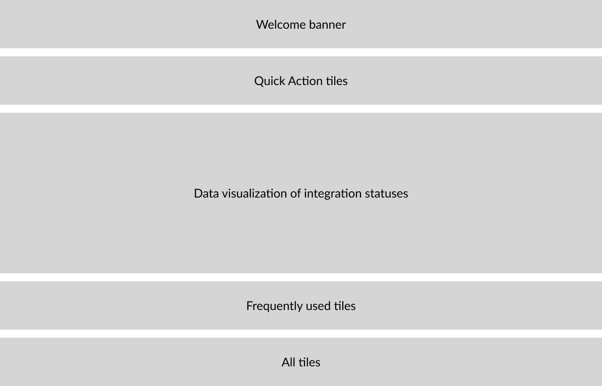
initial information architecture
At this point, a Jr. UX Designer assisted me with creating the mockups. Observations guided how we structured the first concept.
- SAP dashboards and portals begin with a welcome message.
- Some tools related to setup/creation tools are used first.
- After setup, Configuration Managers monitor integrations. A good dashboard shows actionable information.
- Some tools being used more than others are sectioned off.
- If needed, the user can search through all tools.
my work + partner's work
I focused on the data visualization component while he focused on the tiles. Considering there are several integration categories, I used progressive disclosure to land on the last iteration, so that users are not bombarded. Then we put our designs together.


two divergent concepts
Our hypothesis was that Configuration Managers only need a small handful of tools and their data visualized. We developed Version 1 to support that hypothesis, and we developed Version 2 to challenge it. Version 2 assumes that many tools will be useful.
Version 1: Setup tools and data visualization above the fold

Version 2: Everything above the fold

A/B testing
I observed and participated in the sessions while the UX researcher facilitated.

validations
- Most Configuration Managers use the dashboard to create integrations and maintain them.
- Most only use 3-4 tiles
- Participants understood the data visualization.
surprises
- Some participants preferred Version 2 for its full display
- Some tiles were completely unfamiliar or never noticed prior
- They simultaneously want to explore tool and fear experimenting with them.
- A "Last hour" time setting is needed for setup phases.
challenges
- Some participants did not care for the total number of integrations.
- Participants wanted the functionality of Version 1 but the page height of Version 2.
takeaways
- More participants voted in favor of Version 1 because the updated headings and succinct descriptions instantly made the dashboard feel more approachable, so that they could explore the tools more freely. This surprised us the most--that multiple users said they were afraid of the tools for lack of information.
- Data visualization is an enormous value driver. We discovered that users had to wait for colleagues to inform them when integrations broke, because this information was previously buried under tables of data.
APPLYING the FEEDBACK

color codes
Stakeholder
Developer
Designer
User
updates
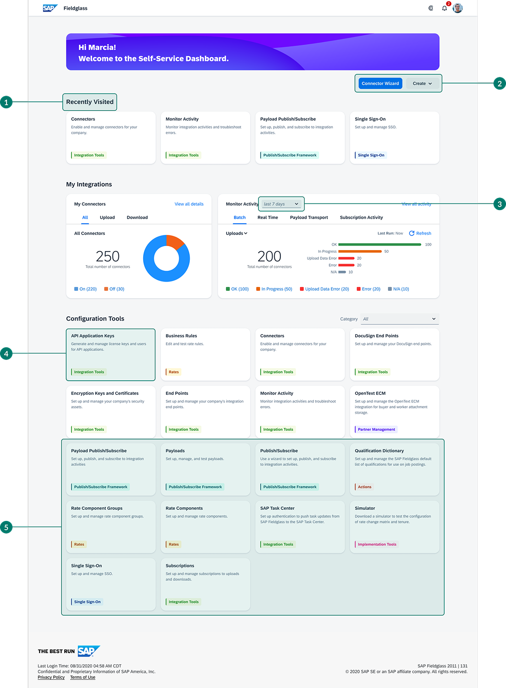
- Prioritize last used tiles to add value above the fold.
- Replace Quick Actions section with buttons.
- Add “last hour” as a filter option--necessary for setup stages.
- Update the tag colors and remove noisy icons (low ROI).
- Display all tiles instead of loading through carousel.
before/after
Despite stakeholder approval, weeks passed with no sign of initiating the software development process for the redesigned dashboard. Only I was left to advocate for its delivery. I reminded stakeholders for multiple weeks. Development didn't begin until I contacted higher level management and presented my case. Finally leadership assembled a project team to build the new Self-Service Dashboard.


a success!
customers
From May to September, in terms of login activity, the percent of Configuration Managers who were monthly active users grew from 10% to 18%.
sales team
The Sales team reported improved presentations, and the business overshot its renewal and new client booking goals by 9% at the end of the year.
- Significantly better than where it was."
- Visually appealing and easy for me to tell a compelling story."
support team
The Support team reported no increase in integration-related cases despite the increase in Configuration Managers.
integrations team
The Integrations team was inspired by the insights that the UX researcher and I shared with them, and they invited me to continue collaborating with them on 16+ additional Self-Service feature enhancements.

Home
© 2025 Jason Wong